Saturday, November 22, 2014

Fall Neutral Gradient!

Hey guys! Today I have a Fall appropriate mani to share with you all! I actually did these because it was appropriate for a job interview I had (which I got! :D) and I only realized afterwards that it's perfect for fall! Its subtle yet says something and is easy to do!


The colors I used for this mani are OPI Don't Bossa Nova Me Around and OPI Taupe-less Beach--my two favorite nudes!


I first used FingerPaints Paper Mache for the base, then I painted OPI DBNMA and OPI TLB on a makeup sponge wedge and blended the two on my nails. I then repeated this process until I got the desired opacity.


I ended up liking this nail art more than I expected! I hope you all like this as much as I do!
Feel free to leave questions or comments below!

XOXO


Cierra

Monday, November 3, 2014

Went 'N Wild Megalast Limited Edition Matte Fall Collection Swatches and Review

Hello Fall! It is officially my favorite season, even though it did start a little late (I am in Florida after all), and that means not just Pumpkin Spice Latte's, trendy Fall attire or ah-MAZE-ing weather, but also something that us fellow nail polish addicts look forward to: Fall themed Nail Polish Collections! And on that note, I have the Limited Edition Went 'N Wild Megalast Matte Fall Collection to share with you all!


The entire collection consists of 6 matte-drying cremes. I'll be showing them to you guys in order from lightest to darkest.

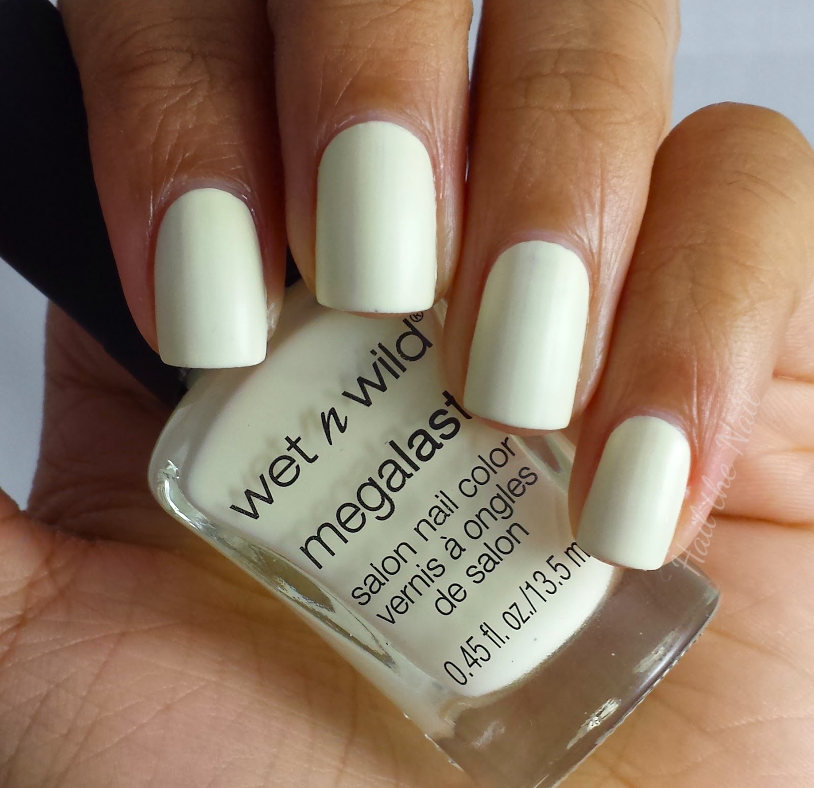
LAC- My Mani?

First one up to bat is LAC- My Mani?: an off-white, milky creme. A little brighter than most colors like this- like OPI MVIB- but it doesn't change the hue. I loved how this one looked on me! Here I applied 2 coats and no top coat.

Rouge 66

Rouge 66 is a vivid red creme. Gosh I love this one! A bright, assertive, classic red that says enough just by herself! Even my SG4 camera managed to capture how bold she is. Here I applied 2 coats and no top-coat.

So Berry On Trend

So Berry On Trend is a mauve, purple-wannabe, raspberry creme. She's one of those there but not too in your face. Here I applied 2 coats and no top coat.

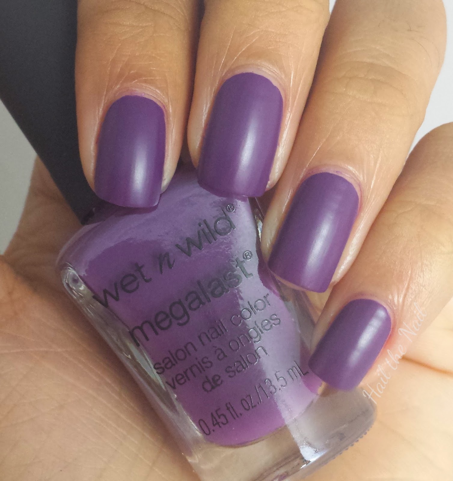
Careful, It's Vine-tage

Careful, It's Vine-tage is a deep purple creme. She's dark enough to be suited for the fall collection, but not too dark to where you have to contemplate which hue of purple she is. A lighter plum color, if you will. Here I applied 2 coats and no top coat.

Echo Dark

Echo Dark is a rich, navy blue creme. She doesn't exhibit anything special, but I for one are a sucker for this shade! Here I applied 2 coats and no top coat.

Distressed to Impress

Distressed to Impress is a yummy, medium brown creme. Reminds me of chocolate haha! Once again, nothing special, but a staple color for any nail artist/fall enthusiast! Brown can be an awkward shade to wear, not only because certain shades of it might not look well on some skin tones, but also because its not really a nail color. Most people who wear brown often wear it in some form of nail art, but I actually wouldn't mind wearing this color by itself. It has beauty even in its simplicity. Here I applied 2 coats and no top coat.

And that's the entire collection! Overall, I would say I am glad I picked these up: loving the fall hues, the formula was a bit thick but it made it easier to apply, the brush is nice and wide, and they are inexpensive! These do dry matte, but if you want that glossy look, its nothing a coat of your fav top coat won't fix! If you are looking for fall colors this season and you're on a budget, I highly recommend you pick these up at your local Walgreens (where I got mine). Another thing I also admire about this collection is that they are versatile enough so that you can create nail art with them for an overall fall themed look! (Hint, Hint ;D) 

Keep in mind that these are a LIMITED EDITION collection, so they won't be around for much longer if they aren't gone already. I would snatch them up ASAP!

Thank you all for reading and I hoped this helped any of you in fall nail polish distress :D

xoxo

Cierra

Saturday, November 1, 2014

Halloween Nail art: Candy Corn Gradient!

I know I know, it's November 1st- the day day after Halloween, but I've been so lately with work I didn't get a chance to post and I figured later is better than never! Anyways, here's the nail art I wore on Halloween.


I did a simple, Candy Corn Gradient using a makeup sponge, OPI's Angel with a lead foot (holding), Where Did Suzi's Man-go?, and Can't Cope-acabana.

I first applied 2 coats of OPI's Angel with a Leadfoot, and then painted the colors in the order I wanted them on my nail onto the makeup sponge.Then I just applied the sponge straight onto my nail. I finished it off with a coat of HK Glisten & Glow topcoat.
 Simple and easy!

If you want to get this look or use the gradient technique in any way, there are a lot of tutorials out there, but to be honest, experience is key! Everyone has their own take on it that works for them. I will be doing a segment on my blog shortly that deals with nail art basics and I will definitely incorporate the gradient sponge technique into it, so stay tuned!

I hope you all had a Happy Halloween and didn't get any cavities! As for November: Bring on the fall nail art!

XOXO

Cierra

Wednesday, October 29, 2014

Breast Cancer Awareness Nail Art!

Hey guys!  So I realized that October is almost over and I haven't posted any Breast Cancer Awareness nail art! So I did this simple but cute mani to contribute to raising BCA. Enjoy!:)


For my index, middle, and pinky fingers, I used 2 coats of OPI Kiss Me I'm Brazilian as my base, and  1 coat of OPI Desperately Seeking Sequins on top.


For my ring finger, I used OPI KMIB again as my base and placed Born Pretty Store Free Silver Glitter in the shape of a ribbon. To top it all off I used HK Glisten and Glow Topcoat.


Above is a sunlight shot to show you the iridescence in the glitter. I loooove it! *o*

Like I said, it's simple, but I honestly can't think of anything else more girly(and perfect for BCA) than pink and glitter! I really like this mani and I hope you do too!

XOXO

Cierra

Sunday, October 12, 2014

OPI Brazil Collection: Comparison Swatches

Hey guys! Today I have comparison swatches for the OPI Brazil Collection to share with you all. This is the first post I am making of this series I'm starting on my blog! I'll post pics with a swatch of the collection I'm comparing as well as swatches of colors that are similar, that way you can see if there are duplicates!

OPI Kiss Me I'm Brazilian

Here I have, from left to right, Zoya Lara, Urban Decay Woodstock, OPI Kiss Me I'm Brazilian and China Glaze Sugar High. KMIB is a bit brighter and more bubblegum than Woodstock, which came the closest to being a dupe in my collection. Sugar High was the next runner up and is less bright than KMIB and is significantly darker. Finally, Lara is the darkest compared to the others. KMIB is definitely a must have in my collection, and IMO anyone else's too!

OPI I Just Can't Cope-acabana

From left to right: OPI I Just Can't Cope-acabana, China Glaze Happy Go Lucky, OPI I Just Can''t Cope-acabana, and China Galze Lemon Fizz. ICC is darker than CG LF, but brighter than CG HGL. ICC is a perfect true yellow, without being too dull.

OPI Where Did Suzi's Man-Go?

From left to right I have OPI Where Did Suzi's Man-Go?, China Glaze Peachy Keen, OPI Where Did Suzi's Man-Go?, and China Glaze Peachy Keen. CG PK is the only real peachy color I have in my collection that could possibly be a dupe to WDSMG. WDSMG is more orange-y rather than CG PK, which seems to be paler and more into the coral hues of the color spectrum.

OPI Amazon-Amazoff

From left to right: OPI Amazon-Amazoff, Butter London Slapper, OPI Amazon-Amazoff, China Glaze Custom Kicks. I don't have a color like AA, obviously, but BL S and CG CK are the closest colors I have to her. OPI AA is significantly darker than BL S and CG CK, more like a dark teal hue. BL S is a lighter, somewhat brighter teal blue and CG CK is slightly darker than BL S and has a gold shimmer throughout it.

OPI Don't Bossa Nova Me Around and Taupe-less Beach

From left to right: OPI My Vampire is Buff, OPI Don't Bossa Nova Me Around, OPI Taupe-less Beach, and OPI My Vampire is Buff. MVIB is a pale yellow-off whitish hue, whereas DBNMA and TLB are more on the taupe side. Of the two taupes, DBNMA is significantly lighter than TLB and even leans a bit pink (similar to OPI My Very First Knockwurst).

Aaaaand thats it for the swatch comparisons! Thanks so much for reading and I hope this was helpful to you all! Feel free to leave comments/suggestions below on this series or of my blog in general. Have a great day/night! :)

Cierra

Sunday, September 28, 2014

OPI Brazil Collection Swatches and Review

Hello everyone! I am so pumped to share this collection with you! I know I am a little (okay, a lot) late on posting these but they were too beautiful not to share! I do not have the whole collection, however, I do have the majority of it. I hope you enjoy my swatches :)

OPI Kiss Me I'm Brazilian

A prefect, bright, bubblegum creme pink! I absolutely have nothing like this in my collection, and trust me, I have a lot of pinks. Even though there are several bubblegum pinks out there, the formula on KMIB makes her hard to dupe! I applied 2 coats and top coat.

OPI I Just Can't Cope-acabana

I'm not one for yellows (this is actually one of 3 bottles I own!), but I love this one nonetheless! She's a bright, warm, sunshine creme yellow that is bright enough to look good on any skin tone, and does not fall flat like most yellows. I applied 2 coats and top coat.

OPI Where Did Suzi's Man-go?

I would have to describe this one as an light orange leaning peach creme. In certain lightings, she looks orange-y and in others she looks like a plain peach. Nothing special, though, unfortunately. Here I applied 2 coats and top coat.

OPI Amazon-Amazoff

This color was the one that drew me into getting this collection because of its uniqueness and beauty! I have never before seen a color like this one. She's a creme cross between a teal blue and a dark forest green. This is a perfect fall color! A great way to be in season but still have a little color on your nails! But I must warn you: she stains! I didn't get major stains such as everyone else who wore this color, but I did get some nonetheless. I applied 2 coats here and top coat.

OPI Don't Bossa Nova Me Around

O-M-G guys this color is EVERYTHING! Okay, maybe I'm being a little overdramatic, but this is the perfect go-to, says-something without saying too much color! DBNMA is a light taupe/ muted lilac creme shade. I think this is what practically everyone experienced with OPI's My Vampire is Buff, which I couldn't because it just didn't look right with my skin tone. But this beauty is my version of MVIB! This is my favorite of the collection, if I had to pick just one. Here I applied 2 coats and top coat.

OPI Taupe-less Beach

Sweet damn, I never thought I'd love such a "bland" color, for lack of better word. I'm more of a neons and bright kinda girl, and I've never even dreamed of wearing such a muted color, but crap I am I thoroughly surprised! TLB is a muted purple-greyish creme, another perfect color for fall! Here I applied 2 coats and top coat.


Overall, I am impressed with this collection! I loved the little surprises it held in store for me, especially that the ones I chose were all cremes! I hope you guys were as happy as I was with this collection!

xoxo,
Cierra